Loading…
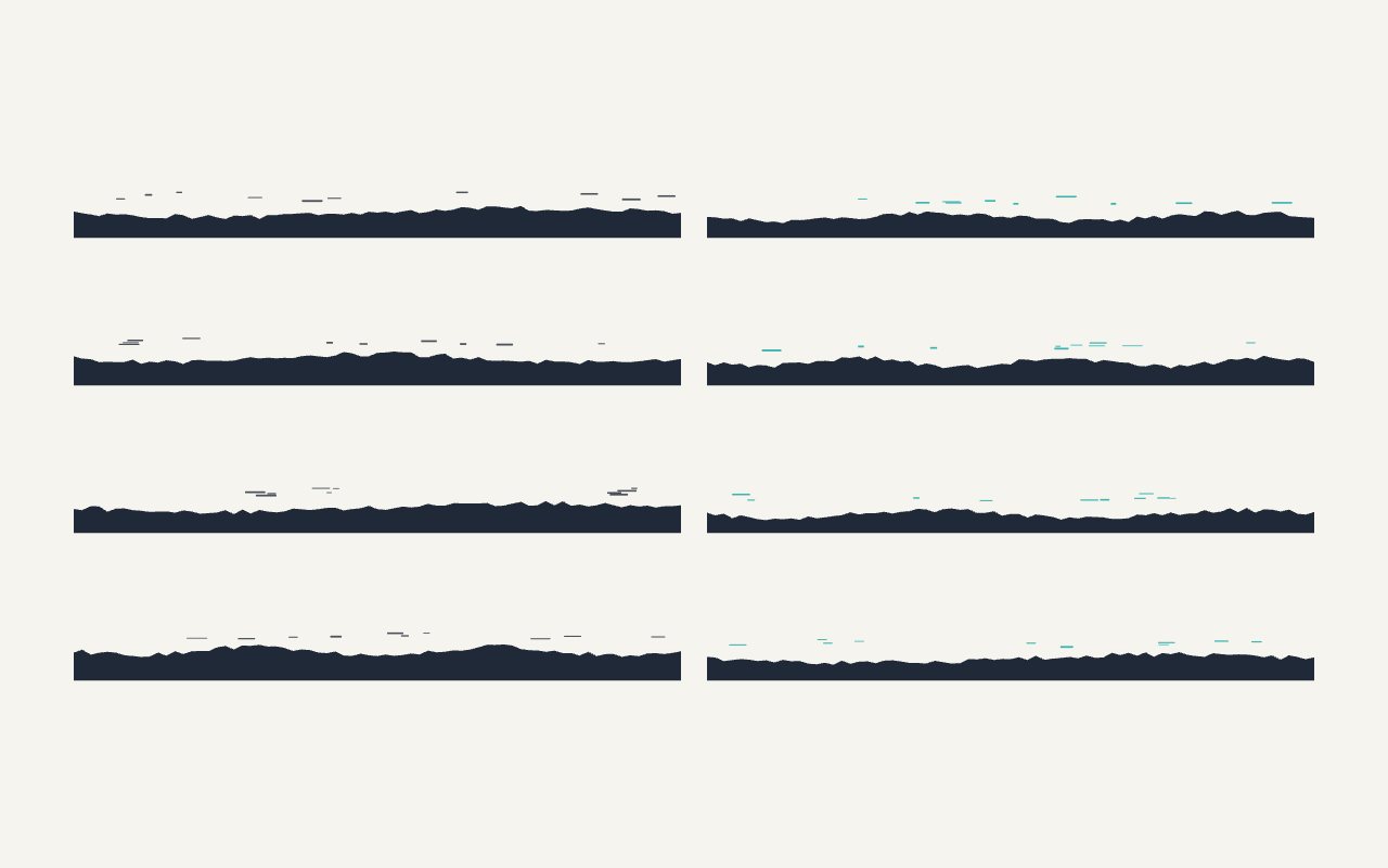
8 glyphs · static · click to copy one
Freedividers · flat · static · light
Tilt Divider
Eight slanted edges: full-height slopes left and right, shallow slopes, two with an accent slope layered behind, a gentle tilt and a centre notch. The cheapest way to break the horizontal rhythm between sections.
The grid
Each divider is a 1440×120 strip filled from a straight edge to the bottom; the two-layer ones add an accent polygon behind at 50 % opacity. Stretch with `preserveAspectRatio="none"`.
How to use it
From sprite to icons in your project.
- 01Look at the grid
Every glyph of the pack, drawn to one grid in one style. Hover one to see its animation when the pack has one.
- 02Recolour it
The colour roles are CSS variables the sprite reads. Swatches and pickers set them live; the prompt carries your values.
- 03Pick your stack
A snippet with the sprite inline, or a typed icon component for Next.js, React, Vue, Astro, WordPress, Shopify or Webflow.
- 04Copy the prompt, or one glyph
The prompt ships the whole sprite verbatim with the mounting rules. Click a glyph to copy it as a standalone SVG.
- 05Download the sprite
One .svg file, every glyph a <symbol>. Inline it once, reference by id.